This platform was built to facilitate audit risks and conduct gap analysis with automation and real-time management by reducing complexity and decreasing associated costs, burdens and time. This system allowed the administrators to create scopes, organise and view all the data around compliance, as well as collaborate with and assign tasks to co-workers and suppliers. Importantly, it also resolved issues around version control which would previously arise from using Excel spreadsheets. This revamped platform now also provided the possibility to monitor, in real time, the progress of each scope or department, as well as the ability to manage multiple projects simultaneously.
Company
Apomatix Ltd
Project Duration
18 months +
Tools & Techniques
Adobe Illustrator & Photoshop, Adobe XD, InVision, UXPin, HTML, CSS, React.js, Material UI
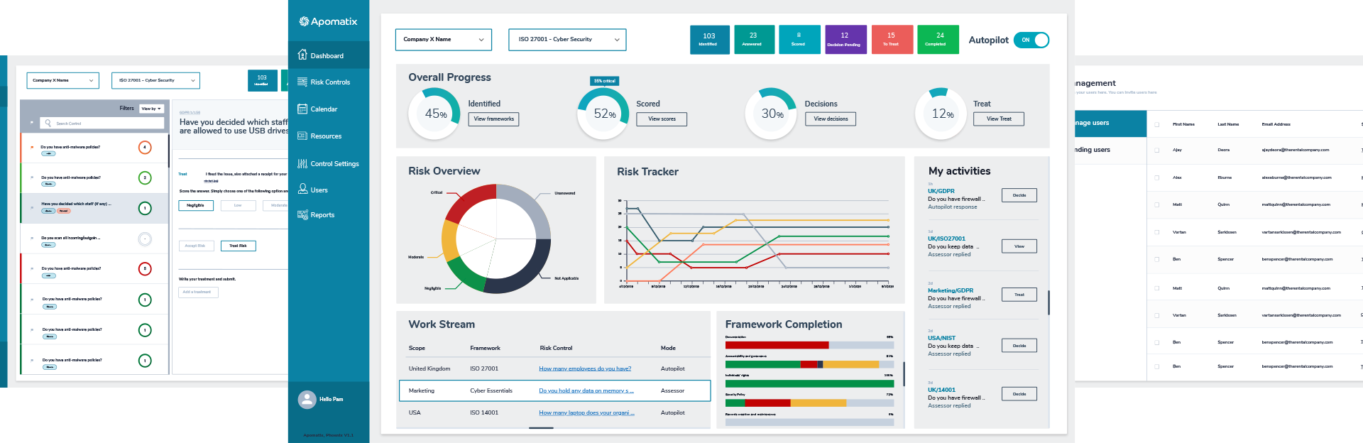
Apomatix Active Audit Management platform was launched in MVP (minimal viable product) state to showcase to auditors the ability to manage risk in one place instead of relying on Excel spreadsheets; it also aimed to maintain the 5 steps to assess risk, that is Identify, Assess, Decide, Treat and Monitor. These were the core goals guiding my design refresh. The platform existed since 2016 and already had clients onboard but the user experience was very poor. It was still very complicated to audit risk compliance and to get other users to collaborate. We decided to review this platform from scratch to improve the user experience using the latest trends and technology. Managing risk compliance can be complicated and boring. There were several challenges with this particular platform. First was the lack of design appeal given its text heavy interface as well as the lack of visual aids and branding. In terms of user experience, the initial platform had far too many click throughs, pop-ups and window sliders which made it even more tedious and complex to use. Moreover, there were too many user roles, where each of them would have a different URL to log in, which conflicted with the possibility that one user could have multiple roles eg. Admin & user or Admin & Assessor. Thus the original platform had become to restrictive and therefore had to be more balanced and aesthetically pleasing while also improving the user experience.
Project Target
Reduce time of managing risk compliance and increase efficiency and easy questionnaire walkthrough.
Make it user friendly and easy to collaborate with other users / members.
Reduce costs and provide real-time analytics to users and manage all risks in one place.
Ability to automate risk controls and receive immediate industry leading guidance on how to remediate risks.
Design Target
Reduce the user flows, click through and interface complexity.
Improve the architecture and hierarchy of information.
Create a technical guideline useful for current and future design and development.
Design with the framework and technology in mind and make it responsive on mobile and tablet.
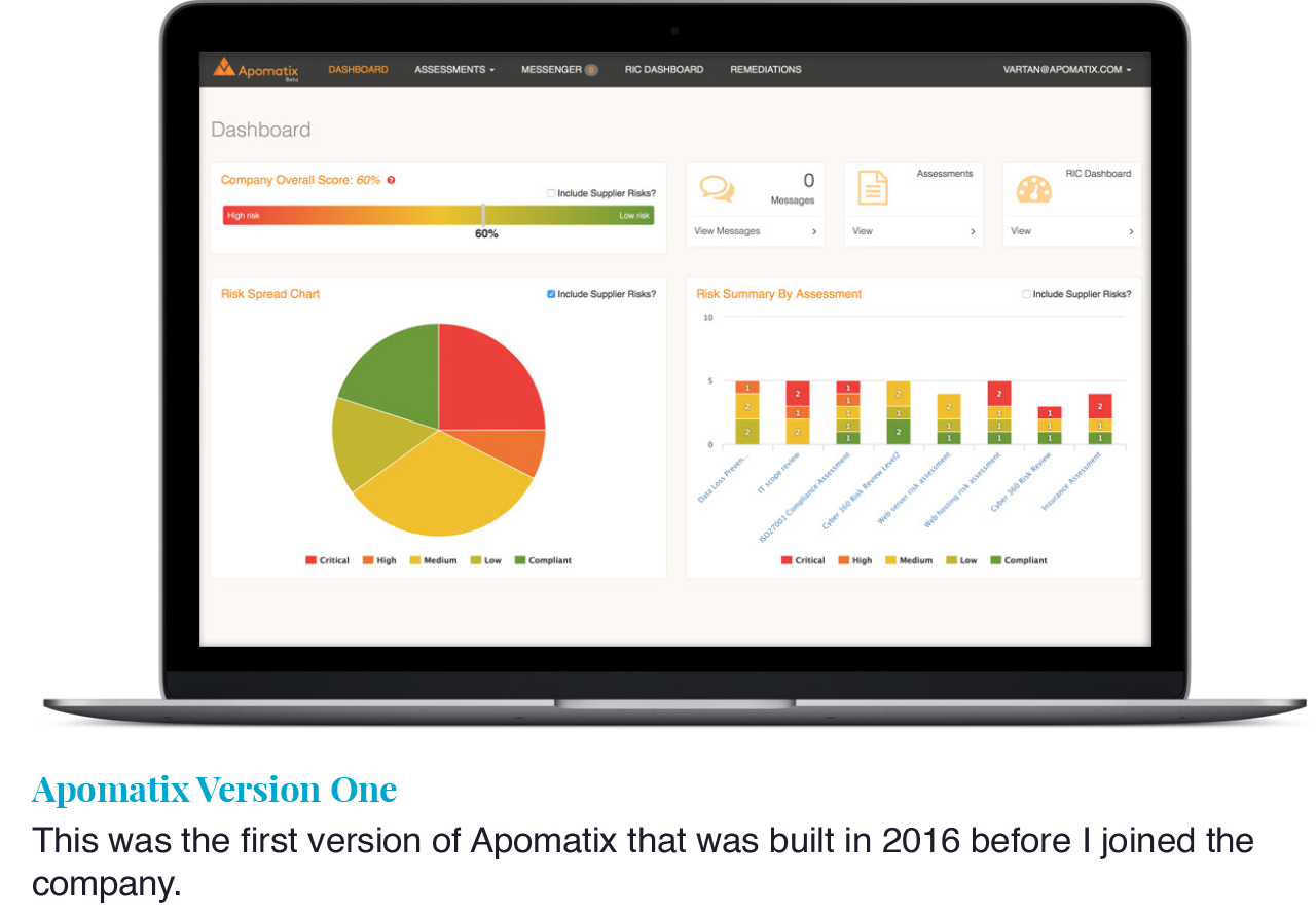
Apomatix was founded in 2016 and the first platform, introduced in 2017, was built by an external agency. I joined Apomatix in summer 2018 at the same time that the design and development of the Apomatix platform were migrated in-house with a team of back-end developers, an auditor and myself as the UX / UI Product Designer. My initial responsibility was to improve the UX of the current platform but during my research we came across some new industry challenges. Therefore, we decided to build a brand new platform from scratch instead of improving the user experience of version 1 as the new concept was totally different. I started studying the ISMS risk assessment process to kick off the project. I wanted to centralise the users in one place and make changing user roles easy and accessible. Noting from the MVP product that it had limited functionality, we also ensured using this new foundation that it would be easy to continue building on top at later stages.. Even though I was given 6 months to finish the MVP project, I also seized the opportunity to consolidate the re-branding of Apomatix.
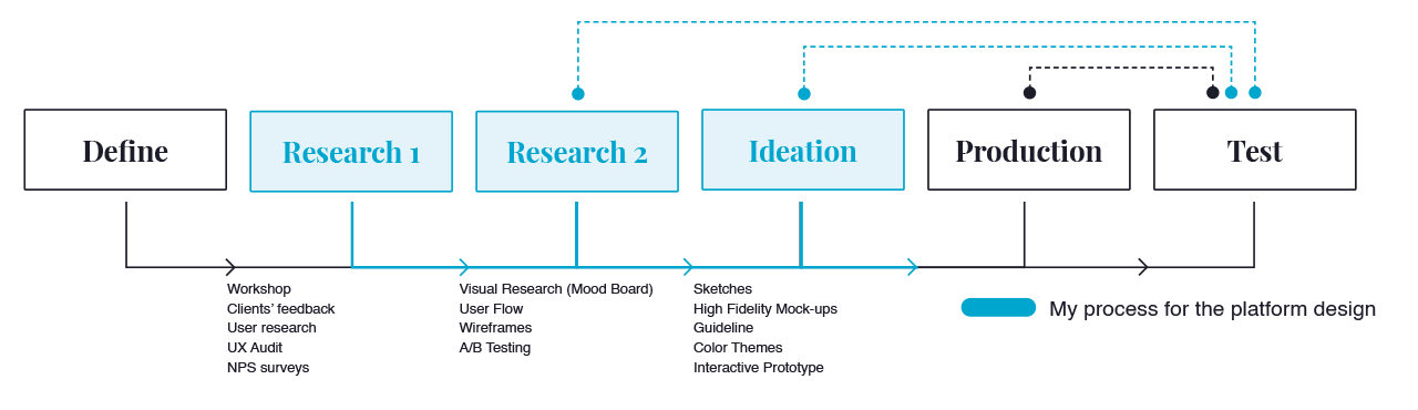
The first thing I did when I was appointed by Apomatix was an E2E test of the old platform as a new user to gauge the first impressions without any external feedback. I tried to understand how the platform works and its functionality. I wrote my first observations which I later used to compare with my colleagues, clients and stakeholder’s feedback. There was a clear consensus between my impressions and the other users’ conclusions. I completed a full UX Audit in order to thouroughly analyse the user journeys section by section which I organised into three topics: User Experience, User Interface and Functionality. Upon completion of my report, I made a presentation to my colleagues and stakeholders and proposed to re-design the user flow from scratch in order to reduce complexity and achieve the 5 steps of risk management, that is: Identify, Assess, Decide, Treatment, Monitor. Following the re-designing of the user flow, the next step was to research clean and modern UIs that I compiled in mood boards. I started making some sketches and take inspiration of how the new platform could look. With more ideas in mind, I started sketching more designs in my notepad and jumped to work on the High Fidelity mock-ups using Adobe XD and InVision for the interactive prototype. I presented the HF mockups to the stakeholders with different colour themes to get them approved so that I can move on to the other features. At the same time, I started creating a UI style guide to make the current and future developement easier and to help the developers to start coding the basic theme. After each component, I was liaising with our internal auditor and one stakeholder to help me better evaluate the current against the new proposed platform. I always try to design the best experience, not for myself but for the actual users and make sure they are in control of the product. At the end of the day, it is to facilitate the users’ experience and make sure this is a tool that improves the way they manage their internal audits and saves their precious time.
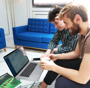
Getting genuine feedback from real users help massively with constructing and designing a product as they are the ones who use them. The best UX experience is when you design a product for your client and not for me and they are delighted to use it everyday as it is effective and make their tasks a lot easier on a daily basis. So I decided to interview one of our real clients to show them the initial concept vs the old platform which they were already using.
Evangelos, Internal Auditor, London
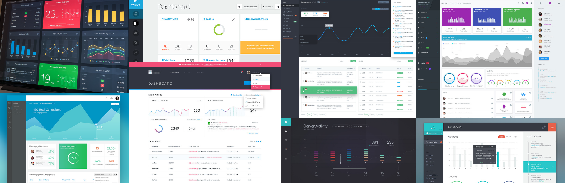
Looking for ideas online to improve the interface, the user experience and solve the functionality problems, I saved some ideas in a mood board. I do this for every project - having this by my side to use as a reference is very helpful when I feel stuck in my design process.
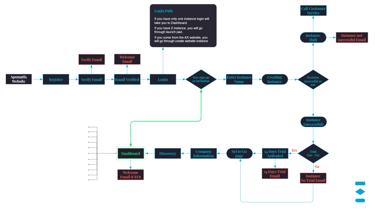
After analysing the feedback and my notes, one of the challenges was the onboarding process where users need to go through a discovery step before we provide them with the precise frameworks that suit their business needs. I had to reduce the number of steps and click through. I started working on a new user flow to make the user journey easier, quicker and also user friendly.
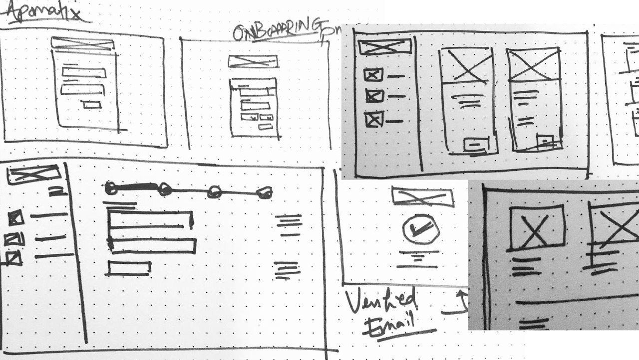
Using the new user flow, my references and the original platform, I made sketches to start visualising my first ideas before spending time on high fidelity mock-ups.
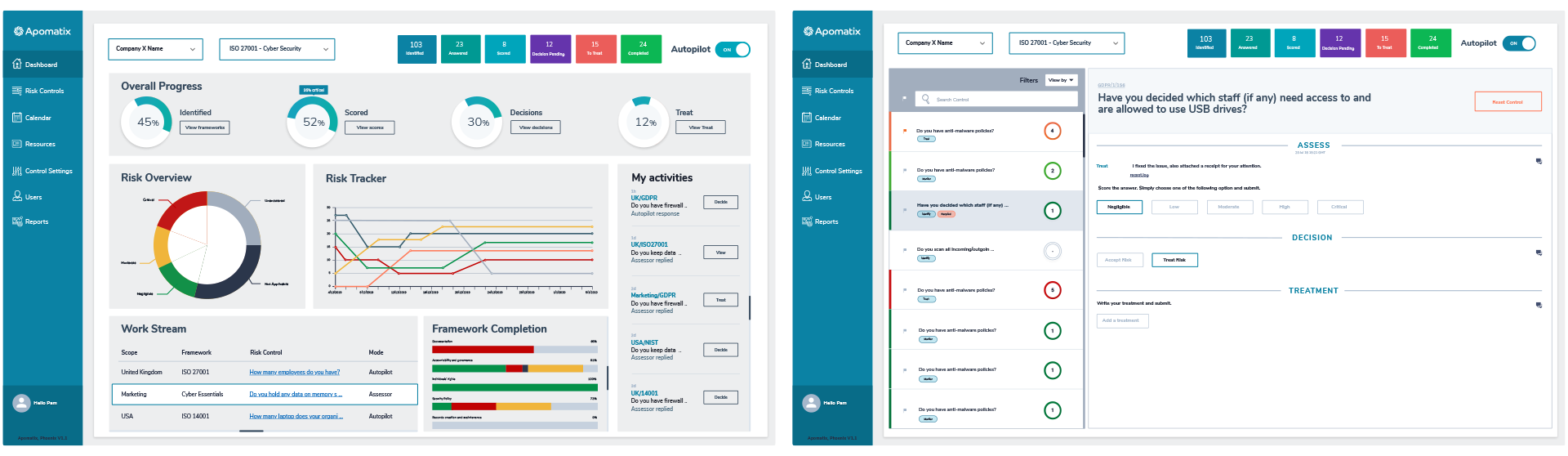
Having mocked up a few ideas, I presented them to the product owner to get their initial approval. My first idea was approved so I quickly started working on the High-Fidelity Mock-Ups using Adobe XD.
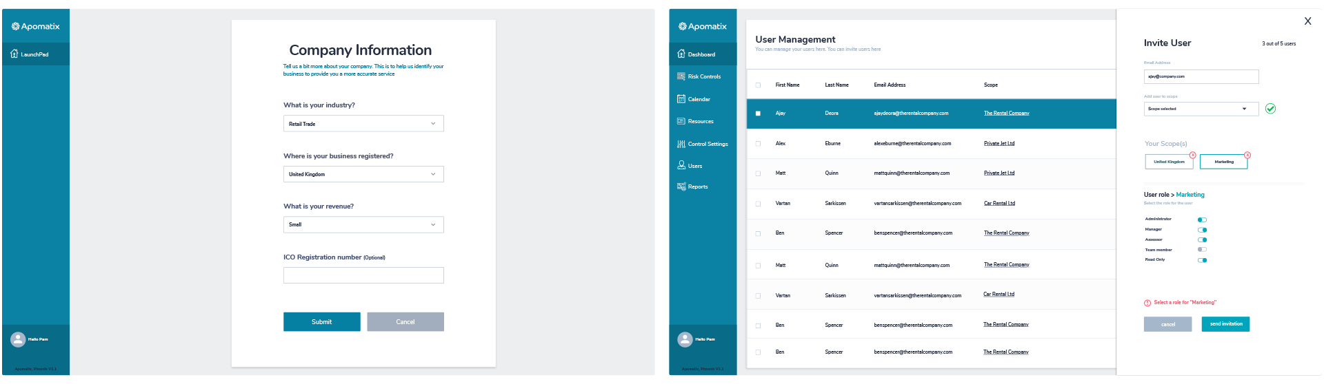
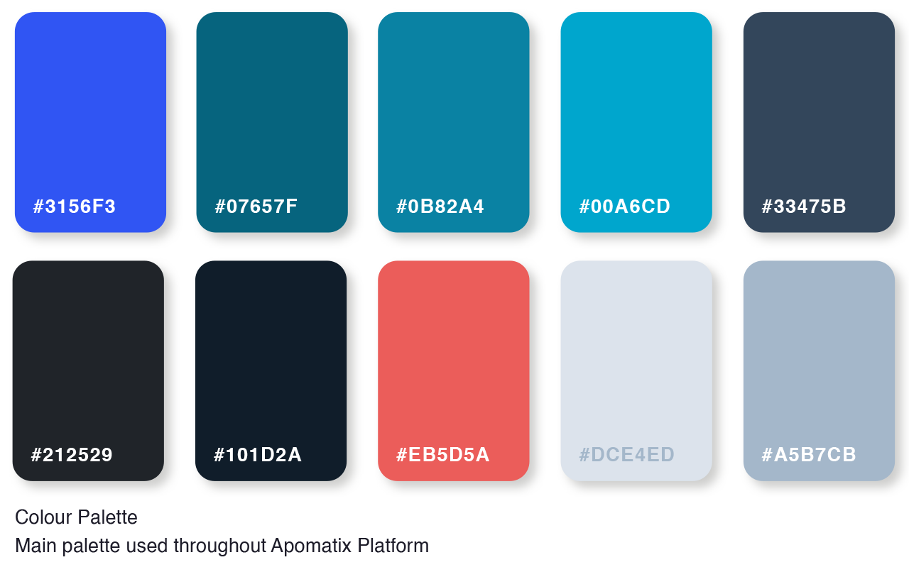
Another important task in this project was to improve the Apomatix branding presence. I updated the colour palette and updated all the web elements such as form elements, buttons, micro-injections, etc. Also, I created a guideline designed to facilitate the developers, tasks by having this document with all the UI details for reference.
From the start, this project had a clear objective: improve the user experience of the old platform and tackle the challenge of making risk management easier to handle on a day to day basis thus saving our clients from hiring expensive consultants to conduct their risk assessments. This tool is intuitive whereby clients can perform their internal audit by helping you save money, time and increase engagement with your colleagues. The Apomatix platform refresh is a strong example of how a tasteful, considered and well-coordinated approach to designing user interface and user experience is key to bringing innovative solutions to market. Here are some of the clients’ feedback below.